Where do I even start? As I attempt to summarize my experience participating in my first Iron Viz feeder competition, a variety of titles for this post come to mind. They include:
Instead, what I want to tell you about is the power of simplifying. Don't worry, it's not as boring as it sounds. The following could also be titled: "Design mistakes I made in an attempt to find the wow factor."
As usual, I am going to be honest with you. One of the main reasons I had a hard time getting off the line in this competition is because I was intimidated. I design and build data visualizations to be tools, to translate complicated numbers into something people can understand, and to tell a story. It would seem that a competition that is judged on (1) analysis, (2) storytelling, and (3) design would be right up my alley. False.
I feel that there is a "wow" factor required for Iron Viz that is hard for me. I want my designs to be clean, effective, and aesthetically pleasing. Often times, this means my design is simple. I seriously love a good bar chart. I look at the competition entries being published and I think: "holy crap that's cool", which is quickly followed by "I can't compete with that". Then on Friday, while scrolling the amazing #IronViz twitter feed, I came across a post by Lindsay Betzendahl that reminded me of why I wanted to do this in the first place. Her post was titled "I #IronViz Not to Win But to Be". That hit home.
So, with a much needed boost and little time to spare, I said goodbye to my weekend and I went full speed ahead. I made the commitment to myself that I would submit an entry. No matter what. I designed, I compiled, and I vizzed. I am happy to say that I made the deadline (which was not looking promising at about 9pm with half of my dashboard still blank). My perfectionist self didn't want to submit what I had, but I am happy I did (my Twitter post just after midnight will back this up).
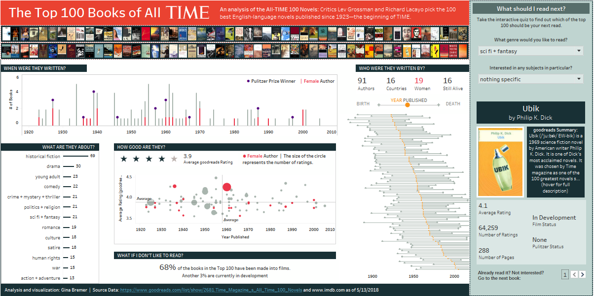
I'm done! But not quite… I woke up this morning and could immediately see where I went wrong: the "wow". My viz was over-complicated in an attempt to find this elusive "wow" factor. I believe at 11pm last night this translated in my head as "put as many cool and interesting things on the dashboard as you possibly can". Unfortunately, this is not my style (or best practice for that matter), and therefore the visualization I submitted doesn't feel right. Both my layout and my story felt cluttered.
With a few hours of sleep and fresh eyes, I have created a second iteration of my dashboard this morning. A little makeover of my own work if you will. I didn't do it for the competition (that deadline has passed), but rather for the spirit behind the competition: to practice and hone my skills and to participate and share in the Tableau community. This truly has been a valuable learning experience for me.
So what did I do? I simplified. When you spend time compiling and building something, the right thing to do (delete it!) often feels wrong. That being said, when I took a step back it was clear to see elements of my dashboard that were not contributing to the story I was trying to tell. I asked myself: Is that chart really necessary or would a simple number be clearer? What do those countries even represent? Where is my eye being drawn and is that where I want people to focus? Is it just me or is that graph seriously hard to read?
In the end, a couple small design changes made a big impact in my eyes. I have a visualization that is cleaner and clearer and I can honestly say that I am excited for the next feeder competition to put my newfound insights into practice.
- "Why procrastination is bad"
- "Compiling your own data source: How it feels to copy and paste for 48 hours"
- "Functionality vs. Design: How I didn't balance my time right"
- "Infographic vs. Interactivity: I want both"
- "The other entries are so intimidatingly good where do I even start?"
Instead, what I want to tell you about is the power of simplifying. Don't worry, it's not as boring as it sounds. The following could also be titled: "Design mistakes I made in an attempt to find the wow factor."
As usual, I am going to be honest with you. One of the main reasons I had a hard time getting off the line in this competition is because I was intimidated. I design and build data visualizations to be tools, to translate complicated numbers into something people can understand, and to tell a story. It would seem that a competition that is judged on (1) analysis, (2) storytelling, and (3) design would be right up my alley. False.
I feel that there is a "wow" factor required for Iron Viz that is hard for me. I want my designs to be clean, effective, and aesthetically pleasing. Often times, this means my design is simple. I seriously love a good bar chart. I look at the competition entries being published and I think: "holy crap that's cool", which is quickly followed by "I can't compete with that". Then on Friday, while scrolling the amazing #IronViz twitter feed, I came across a post by Lindsay Betzendahl that reminded me of why I wanted to do this in the first place. Her post was titled "I #IronViz Not to Win But to Be". That hit home.
So, with a much needed boost and little time to spare, I said goodbye to my weekend and I went full speed ahead. I made the commitment to myself that I would submit an entry. No matter what. I designed, I compiled, and I vizzed. I am happy to say that I made the deadline (which was not looking promising at about 9pm with half of my dashboard still blank). My perfectionist self didn't want to submit what I had, but I am happy I did (my Twitter post just after midnight will back this up).
I'm done! But not quite… I woke up this morning and could immediately see where I went wrong: the "wow". My viz was over-complicated in an attempt to find this elusive "wow" factor. I believe at 11pm last night this translated in my head as "put as many cool and interesting things on the dashboard as you possibly can". Unfortunately, this is not my style (or best practice for that matter), and therefore the visualization I submitted doesn't feel right. Both my layout and my story felt cluttered.
With a few hours of sleep and fresh eyes, I have created a second iteration of my dashboard this morning. A little makeover of my own work if you will. I didn't do it for the competition (that deadline has passed), but rather for the spirit behind the competition: to practice and hone my skills and to participate and share in the Tableau community. This truly has been a valuable learning experience for me.
So what did I do? I simplified. When you spend time compiling and building something, the right thing to do (delete it!) often feels wrong. That being said, when I took a step back it was clear to see elements of my dashboard that were not contributing to the story I was trying to tell. I asked myself: Is that chart really necessary or would a simple number be clearer? What do those countries even represent? Where is my eye being drawn and is that where I want people to focus? Is it just me or is that graph seriously hard to read?
In the end, a couple small design changes made a big impact in my eyes. I have a visualization that is cleaner and clearer and I can honestly say that I am excited for the next feeder competition to put my newfound insights into practice.
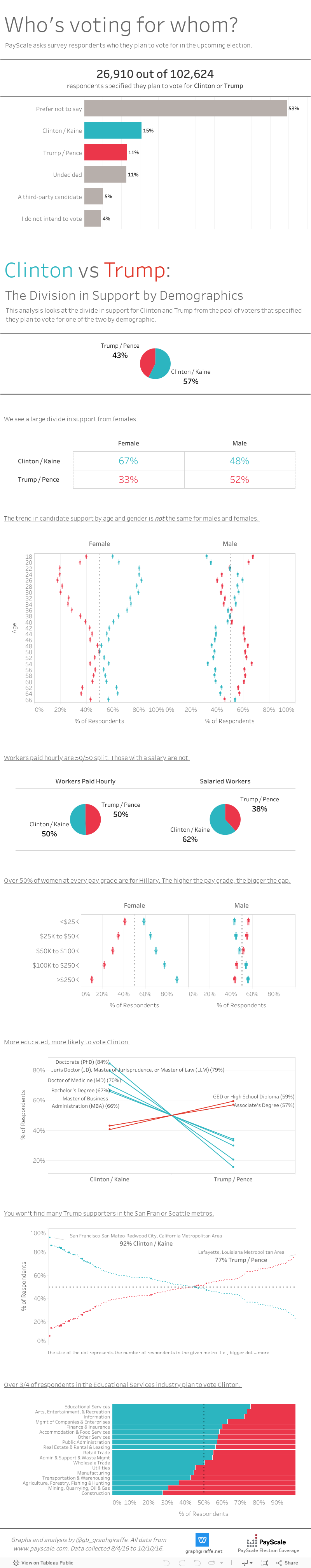
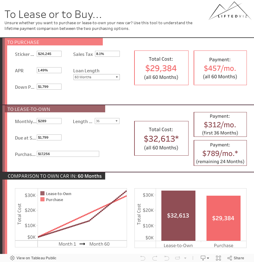
| Viz Submitted 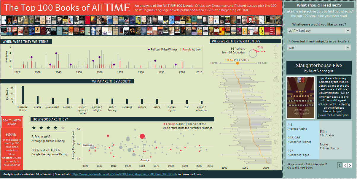 | Updated Viz  |