For the October 2015 Seattle Tableau User Group (SeaTUG) meetup, I presented the PayScale-Tableau user story with a focus on our automated PDF report template that I built in Tableau. This PDF report template has led to a new product line at PayScale, it has reduced our report creation time from 3 weeks to 2 days, and it is how we are leveraging Desktop to create a scalable distribution channel for our data analysis and visualizations. Many of the attendees of the SeaTUG meetup showed interest in my presentation so I decided to make a video! The following two videos contain a brief overview of PayScale, why we started using Tableau, the business problem we were faced with, how creating PDFs in Tableau Desktop was our solution, and a brief tutorial on how you can make your own automated PDF in Tableau. This is my first ever video tutorial so please comment if you have questions or tweet me at @gb_graphgiraffe! Thanks for watching :)
|
This is it folks! This is a gallery of visualizations I have created that are published on Tableau Public. Clicking on the screenshots below will take you to the interactive graph on Tableau Public.
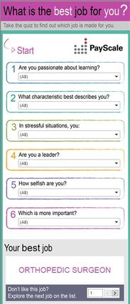
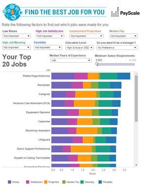
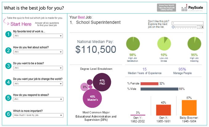 This was my next big claim to fame. I was asked to refresh the Best Jobs viz and had this idea to completely redesign it into a quiz. It is published on PayScale.com, it was embedded into Business Insider, and has landed over 280,000 views. It is also the first visualization created that I designed "mobile first".
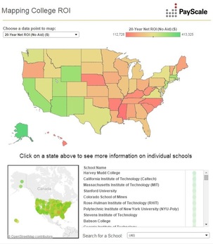
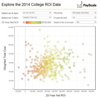
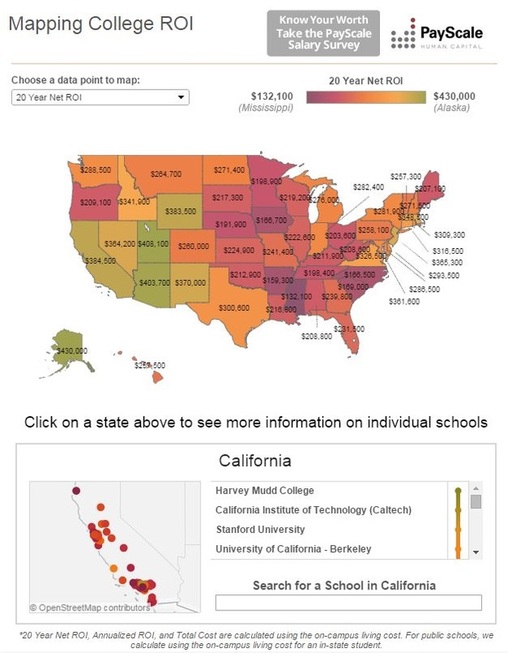 Landed my second Tableau Public Viz of the Day with this visualization! It was created for the 2015 PayScale College ROI package and is published on PayScale.com.
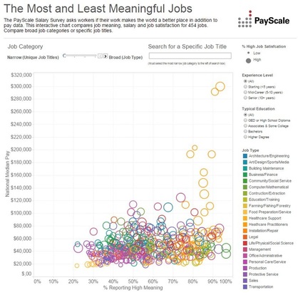 This viz is my claim to fame! It was chosen as the Tableau Public Viz of the Day in August 2014! It has nearly 315,000 views, the most of any viz I have created. It was created for our annual Job Meaning package on PayScale.com. It was a revamp and refresh of a viz that was created for the same package the previous year that saw about 24,000 views.
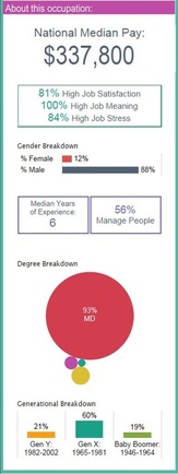
After the very successful release of the PayScale Best Jobs for You tool last month, I asked all the PayScale employees to join the 200,000+ people who have taken the quiz. Over half of the company participated and there were definitely some surprises in the results. I did not expect to see that 34 percent of PayScale employees answered that their favorite type of work was "Creative" while only 27 percent answered "Social". Not everything was a surprise though. For example, data team (my team) has employees in almost every characteristic and we pride ourselves on each bringing something different to the team!
Click around on the visualization below to explore the data! 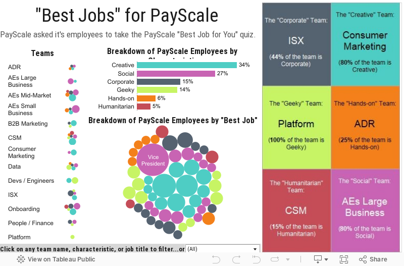
I began my career at PayScale as a Data Analyst a year and three months ago. I was stepping into my first technical career with no real world experience in the tech industry. Granted, 6 years of working in restaurants around the world and a math degree from the University of Washington helped develop skills that would be beneficial in my new role.
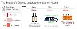
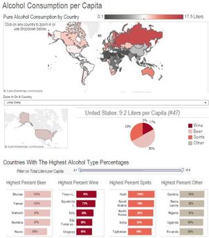
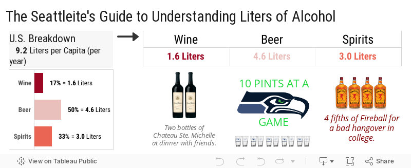
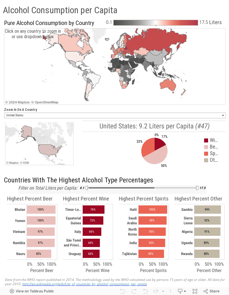
I still had a lot to learn. On my first day at PayScale, I sat down with my new boss to discuss my ramp up plan. “The Plan” was to learn by doing. To be honest, being assigned two projects on my first day was a little intimidating. Especially with minimal knowledge about the company and the tools I would be using. I did know that I’ve always been a hands-on learner and I knew in the end it would be a good fit for me. I was most definitely correct in my assumption. One of my initial projects was to provide the data for an interactive “Find the Best Job for You” tool that we were building with Tableau Software. I had never heard of Tableau before. Oh, how things have changed. “The Plan”, initially, included me learning how to pull data from our internal querying tool, how to manipulate that data in Excel (of which I had minimal knowledge), and providing the clean data to the marketing team in a format suited to building the tool. Part of learning how to format the data, was attending the Tableau training session in order to understand how data is read by the software. It was love at first sight. My career path had already reached the first curve. Data visualization requires a combination of analytic ability, an eye for design, and strong communication skills. Just as we use different words to verbally explain the same information to different audiences, we must use different presentations of data to visually explain the same information to different audiences. To make a long story a bit shorter, let’s fast forward a year. My current job title is now Data Analyst / Data Visualization Specialist, I am the foremost expert in data visualization at PayScale, and I use Tableau every day. Ok, let’s take a look at the journey. It has been a festive winter season here in Seattle. We've had a record-breaking season for the Seahawks, snow falling on mountains, and holiday parties galore that have led many a Seattleite to a celebratory shot or a cold one. As the Seahawks head to the NFC Championship, I wonder how our alcohol consumption compares to countries that don't play American football. So I've decided to investigate which countries drink the most. Before we dive into the details, we need to conceptualize how much a liter of alcohol really is. We are going to look at the U.S. Statistics first to get a good idea. According to the World Health Organization (WHO), the average alcohol consumption among adults (15+) in liters per capita in 2010 was 9.2 liters (17% wine, 50% beer, 33% spirits). Now that we have a good picture in our heads, let's explore how we compare to other countries. We rank 47th for total consumption in liters per capita (out of 188 countries included). We drink 8.3 liters per capita less than the #1 country for alcohol consumption: Belarus. So what's the conclusion? While I predict the beer consumption in Seattle for the championship game this weekend will be elevated, as a country we aren't nearly as high on the list as I imagined us to be.
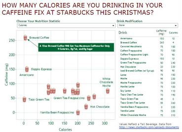
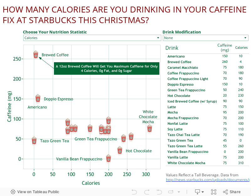
I recently became friends with a fellow Seattleite who does not share my love of coffee. Personally, I typically enjoy a simple Americano with a splash of nonfat milk twice a day, however, the holiday season often brings out the desire for something slightly sweeter. This seems to be the case for those who don't typically drink coffee or tea as well. This is most definitely the case for my new friend. He informed me that during this time of year when his coworkers go out for their afternoon coffee he occasionally breaks his no coffee/tea lifestyle and enjoys a chai tea. When I informed him that I believed chai tea has just as much caffeine as coffee with a lot of additional sugar, I realized I was not confident on that fact, and decided to do some research. I discovered I was pretty spot on given a latte has 75mg of caffeine and 14g of sugar compared to 70mg of caffeine and 32g of sugar in a chai tea latte!
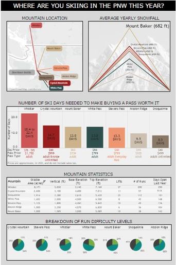
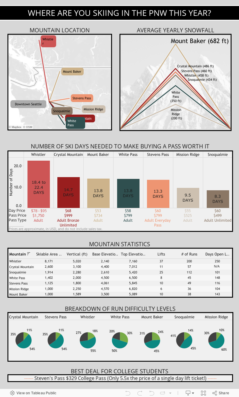
It's almost ski season and like most avid skiers and snowboarders I am counting the days until the mountains open! I'm on snow-forecast.com every couple of hours waiting to see when the next storm is coming in. I live in Seattle currently and I have found that about 99 percent of the time the first question asked when you find another member of the Seattle ski community is "where do you ride?" It seems to surprise a lot of Seattle skiers when I respond that I'm a Mt Baker girl. I understand that Baker may be a little farther away but it is definitely worth the drive to float on some Baker pow, visit my brother at Glacier Ski Shop, stop at the Wake N' Bakery for coffee and a cookie, and ski with my Baker community! While I have already purchased my pass for the 2014-2015 season, I have also decided to make more of an effort to branch out this season and visit some of the other mountains in the area. To decide where to go first, I wanted to compare the mountain stats. From what I discovered, looks like Crystal is next on my list with the second highest average yearly snowfall (486 ft) and skiable acres (2600). Unfortunately, the ticket price is also the second highest at $68. I know what's on my Christmas list!
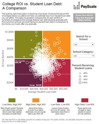
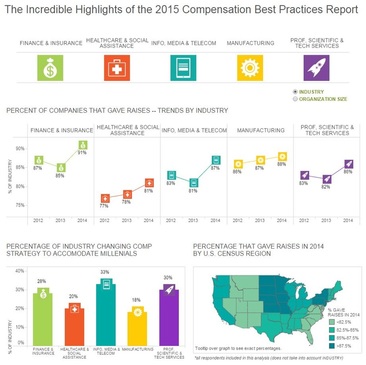
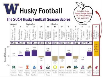
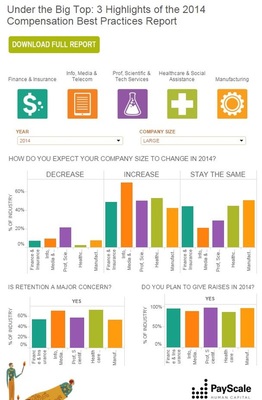
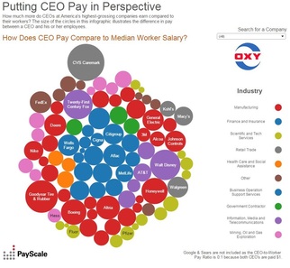
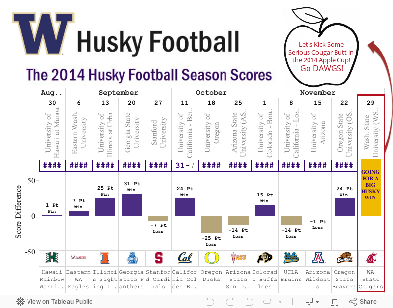
I am officially entering the world of blogging. Over the past year I have fallen in love with data visualization working on both public and internal visualizations for my employer PayScale.com. I started working at PayScale one year ago as a data analyst, proceeded to buy a very large book on Excel from Barnes and Noble, and dove into the world of traditional data analytics. However, my role at the company slowly began to shift as I was introduced to Tableau and began focusing much of my work on data visualization and storytelling with data. I began working not only with our data team but also with our consumer marketing department an increasing amount as my visualization skills improved to help create interactive Tableau visualizations for our data packages found on our website. My first introduction to Tableau was as the analyst on a PR package that calculates the "Best Jobs for You" (Best Jobs Package). I was immediately impressed with the software and wanted to learn more. I continued to help with visualizations (Compensation Best Practices Report) and in March I was given the opportunity to create an entire set of visualizations for the College Return on Investment Package (ROI Package) of which six were finalized and published on Payscale.com. We continued to produce visualizations including Putting CEO Pay in Perspective, College Salary Report Best Majors and Most Meaningful Jobs which landed over 275,000 views and was awarded the Tableau Viz of the Day on August 5th. I am also using Tableau for my internal analytics nearly 50 percent of the time at this point. As I have been consumed with transforming static data into compelling visualizations for much of the year, I now want to visualize almost everything I see and therefore have decided to start a blog and do just that. I thought I would kick it off with a simple viz about the UW Husky football season as we have the Apple Cup this evening! |