This is it folks! This is a gallery of visualizations I have created that are published on Tableau Public. Clicking on the screenshots below will take you to the interactive graph on Tableau Public.
 Part 1 of the viz I made in partnership with the White House as part of the release of a new education API! It is published on PayScale.com and linked on the White House webpage: https://www.whitehouse.gov/the-press-office/2015/09/12/fact-sheet-empowering-students-choose-college-right-them!! 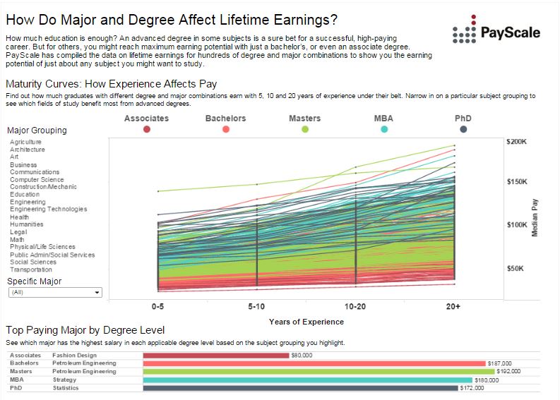 I made this viz as part of the 2015 College Salary Report on PayScale.com. It was also embedded in an article on Business Insider: http://www.businessinsider.com/earning-potential-by-college-major-2015-9 and has landed nearly 150,000 views. It was the 3rd most viewed Tableau Public viz the week ending September 11, 2015: https://public.tableau.com/profile/digitalteam#!/vizhome/TPTop10/Dashboard2 | 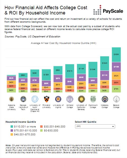 Part 2 of the viz I made in partnership with the White House as part of the release of a new education API! It is published on PayScale.com and linked on the White House webpage: https://www.whitehouse.gov/the-press-office/2015/09/12/fact-sheet-empowering-students-choose-college-right-them!! 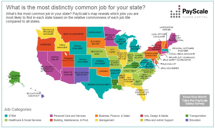 I made this viz as part of the Best Jobs package linked on PayScale.com. It was also embedded in an article on Business Insider: http://www.businessinsider.com/here-is-the-most-distinctly-common-job-in-each-state-2015-4 |
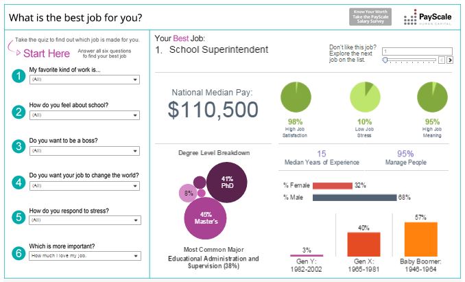
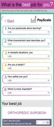
This was my next big claim to fame. I was asked to refresh the Best Jobs viz and had this idea to completely redesign it into a quiz. It is published on PayScale.com, it was embedded into Business Insider, and has landed over 280,000 views. It is also the first visualization created that I designed "mobile first".
|   My fourth Graph Giraffe using public data. |
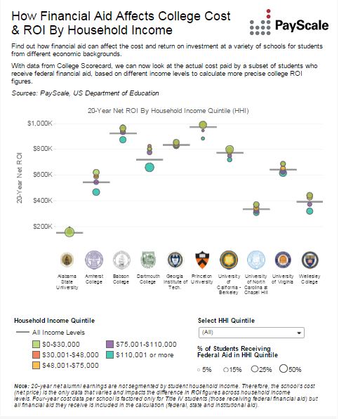
Landed my second Tableau Public Viz of the Day with this visualization! It was created for the 2015 PayScale College ROI package and is published on PayScale.com.
 This visualization was created for the 2015 PayScale College ROI package and is published on PayScale.com.  My third Graph Giraffe using public data. 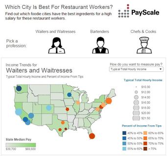 I created this viz for the PayScale Tipping package published on PayScale.com. It was picked up and linked in an article on Eater.com. | 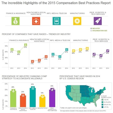 I created this visualization for the 2015 CBPR report on PayScale.com. It has landed over 85,000 views.  My third Graph Giraffe using public data.  This was my first graph that I made for Graph Giraffe! Started my blogging career right here. 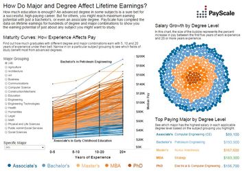 I created the viz for the 2014 PayScale College Salary Report. It was featured on PayScale.com for a year until the release of the refreshed and revamped (with a shiny new LOD calculation!) in the 2015 report. |
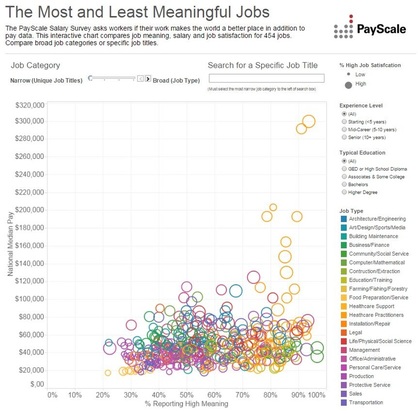
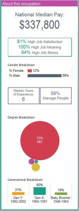
This viz is my claim to fame! It was chosen as the Tableau Public Viz of the Day in August 2014! It has nearly 315,000 views, the most of any viz I have created. It was created for our annual Job Meaning package on PayScale.com. It was a revamp and refresh of a viz that was created for the same package the previous year that saw about 24,000 views.
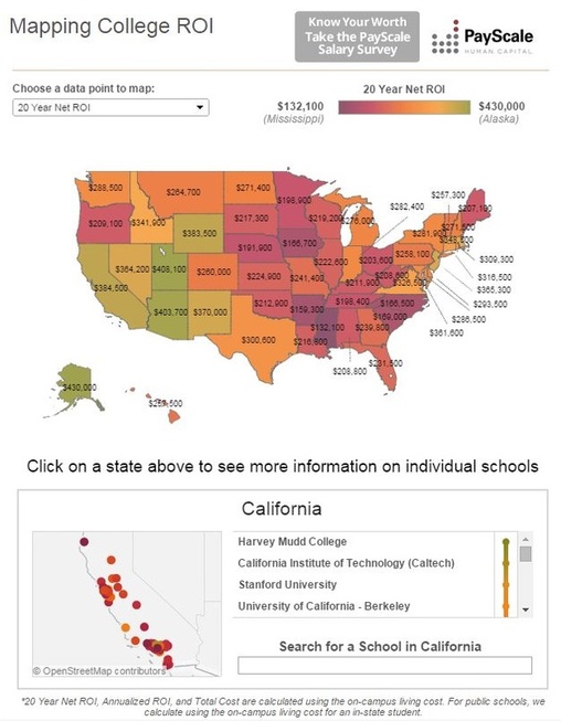
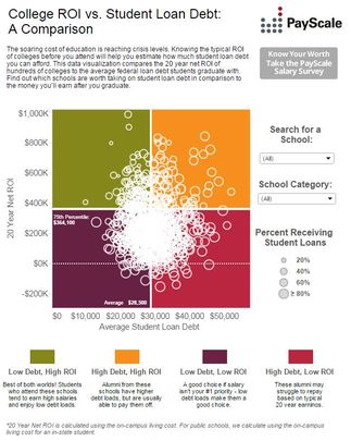
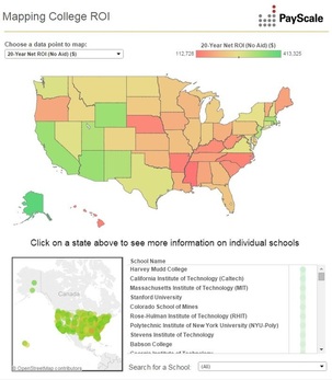 This viz was a part of a set of 6 visualizations I made for our annual College ROI Report published on PayScale.com. They were featured on PayScale.com for a year until the release of the 2015 report. These were the first visualizations for which I created the concept as well as the actual viz. This particular viz was also linked on the Tableau Public Facebook page, landing nearly 75,000 views. 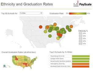 This viz was a part of a set of 6 visualizations I made for our annual College ROI Report published on PayScale.com. They were featured on PayScale.com for a year until the release of the 2015 report. These were the first visualizations for which I created the concept as well as the actual viz. 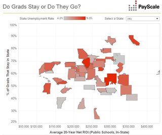 This viz was a part of a set of 6 visualizations I made for our annual College ROI Report published on PayScale.com. They were featured on PayScale.com for a year until the release of the 2015 report. These were the first visualizations for which I created the concept as well as the actual viz. 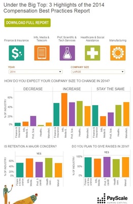 The second Tableau viz I contributed to. The viz was created by our Senior Visual Designer. I was asked to contribute by analyzing, prepping, and adding a data filter for data from previous years. This was published on PayScale.com for a year until it was refreshed in 2015. | 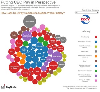 I created this viz for a CEO Pay Package published on PayScale.com. It has remained on the site since it was published and has landed nearly 70,000 views. 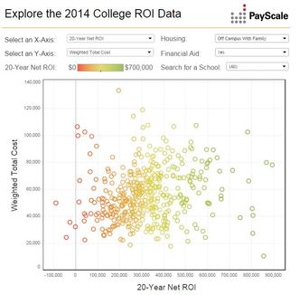 This viz was a part of a set of 6 visualizations I made for our annual College ROI Report published on PayScale.com. These vizzes were the first visualizations I designed the concept for before creation. They were featured on PayScale.com for a year until the release of the 2015 report. 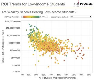 This viz was a part of a set of 6 visualizations I made for our annual College ROI Report published on PayScale.com. These vizzes were the first visualizations I designed the concept for before creation. They were featured on PayScale.com for a year until the release of the 2015 report. 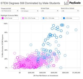 This viz was a part of a set of 6 visualizations I made for our annual College ROI Report published on PayScale.com. These vizzes were the first visualizations I designed the concept for before creation. They were featured on PayScale.com for a year until the release of the 2015 report. 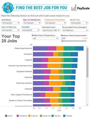 The first Tableau viz I ever contributed to. Was published on PayScale.com for a year until it was refreshed and revamped in 2015. This version had just under 25,000 views. I completed the data analysis and data prep and was a co-creator of the viz. |
