I began my career at PayScale as a Data Analyst a year and three months ago. I was stepping into my first technical career with no real world experience in the tech industry. Granted, 6 years of working in restaurants around the world and a math degree from the University of Washington helped develop skills that would be beneficial in my new role.
I still had a lot to learn.
On my first day at PayScale, I sat down with my new boss to discuss my ramp up plan. “The Plan” was to learn by doing. To be honest, being assigned two projects on my first day was a little intimidating. Especially with minimal knowledge about the company and the tools I would be using. I did know that I’ve always been a hands-on learner and I knew in the end it would be a good fit for me.
I was most definitely correct in my assumption.
One of my initial projects was to provide the data for an interactive “Find the Best Job for You” tool that we were building with Tableau Software. I had never heard of Tableau before. Oh, how things have changed. “The Plan”, initially, included me learning how to pull data from our internal querying tool, how to manipulate that data in Excel (of which I had minimal knowledge), and providing the clean data to the marketing team in a format suited to building the tool. Part of learning how to format the data, was attending the Tableau training session in order to understand how data is read by the software.
It was love at first sight. My career path had already reached the first curve.
Data visualization requires a combination of analytic ability, an eye for design, and strong communication skills. Just as we use different words to verbally explain the same information to different audiences, we must use different presentations of data to visually explain the same information to different audiences.
To make a long story a bit shorter, let’s fast forward a year. My current job title is now Data Analyst / Data Visualization Specialist, I am the foremost expert in data visualization at PayScale, and I use Tableau every day.
Ok, let’s take a look at the journey.
While the original plan was for me to complete the data analysis portion of the “Find the Best Job for You” tool, I ended up playing a role in the creation of the data visualization as well. It was a collaboration of our consumer marketing team, me, and our contact at Tableau that produced the final result. It was the first interactive graph I was ever involved in making.
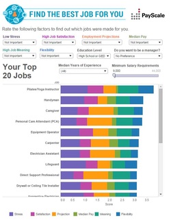
Click on the picture to open interactive in a new tab.
After this introduction to Tableau, I knew it was something I was interested in exploring further. When the B2B Marketing team approached me shortly after to assist with a Tableau visualization they were creating, I eagerly offered to help in any way I could. They had produced a visualization for the 2014 PayScale Compensation Best Practices Report (CBPR) that showcased highlights from the 2014 report. The goal was to add data from previous CBPR reports as well as a filter to select what year you would like to look at. My Tableau knowledge at this point was still limited, but I agreed to see what I could do. The final result:
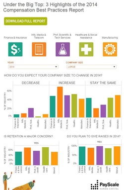
Click on the picture to open interactive in a new tab.
The following month I was given the opportunity to work closely with our Web Product Marketing Manager and Sr. Web Producer to create a collection of visualizations for the College ROI Report, one of PayScale’s largest data packages every year. The report has been produced annually since 2010 in a list format with breakout lists for best schools by type, major, location, etc. For the 2014 report, I was given the time to dive in, find stories hidden in the data, and add to the report by presenting the data in a new and interesting format (in addition to the standard lists). My understanding of Tableau deepened greatly during this time. After multiple weeks of learning and creating, the consumer marketing team chose six of the visualizations I had built to finalize and publish with the ROI package.
Two of the interactive visualizations published, “A Virtual Tour of College ROI” and “Explore the 2014 College ROI Data” allow the users to explore and play with the ROI data. Users are given the ability to focus in on the data points in the ROI package that they find the most interesting. “A Virtual Tour of College ROI” aggregates a selected data point for the schools by state and allows users zoom in on the schools in that state.
Two of the interactive visualizations published, “A Virtual Tour of College ROI” and “Explore the 2014 College ROI Data” allow the users to explore and play with the ROI data. Users are given the ability to focus in on the data points in the ROI package that they find the most interesting. “A Virtual Tour of College ROI” aggregates a selected data point for the schools by state and allows users zoom in on the schools in that state.
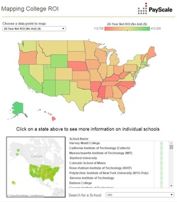
Click on picture to open interactive in a new tab.
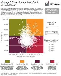
“Explore the 2014 College ROI Data” allows users to create a scatterplot using two selected data points.
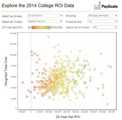
Click on picture to open interactive in a new tab.
The other four visualizations included, “STEM Degrees, Gender and ROI”, “Ethnicity and Graduation Rates”, “ROI Trends for Low-Income Students”, and “Do Grads Stay or Do They Go?” all tell stories found within the data. Our STEM graph shows that schools that award the highest percentage of science, technology, engineering and math (STEM) degrees see the highest ROIs and that these schools are clearly still male-dominated.
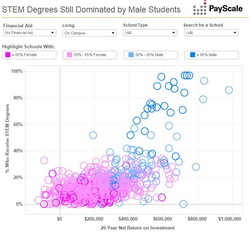
Click on picture to open interactive in a new tab.
The next displays the 50 schools with the highest percentages of Asian students, Black students, Hispanic students, White students, Hawaiian students, and American Indian students and the graduation rate for the schools. We see strong geographic trends for the different ethnicities.
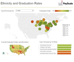
Click on the picture to open interactive in a new tab.
The next shows that the wealthiest schools typically see the highest ROI and are not serving low-income students and that schools typically serving low-income students see lower graduation rates.
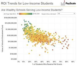
Click on picture to open interactive in a new tab.
Lastly, we examine the percent of in-state grads that stay in state post-graduation. We see that California and Texas both see a high average ROI and have the highest percentage of grads that stay in the state.
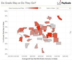
Click on picture to open interactive in a new tab.
I couldn’t have been happier with the end result. The “Virtual Tour of College ROI” map visualization was saw the most traffic with over 70,000 views. Seventy-thousand. It was almost surreal to me. I was 22 years old with an entire page of visualizations on an established and reputable website. Tableau even posted the map to their Viz of the Day Facebook page. I was so grateful to our consumer marketing team for their support and encouragement, as well as their amazing concept and design help.
The most amazing part for me was that I was officially the go-to viz girl at PayScale. A large portion of our data packages were now going to have interactive visuals and I was going to get to work with our consumer marketing team to make them.
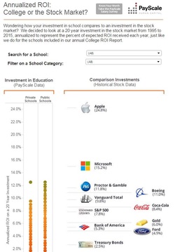
Next, we did a viz for our CEO pay package where we look at how much more CEOs at America's highest-grossing companies earn compared to their workers.
The most amazing part for me was that I was officially the go-to viz girl at PayScale. A large portion of our data packages were now going to have interactive visuals and I was going to get to work with our consumer marketing team to make them.
Next, we did a viz for our CEO pay package where we look at how much more CEOs at America's highest-grossing companies earn compared to their workers.
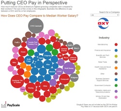
Click on the picture to open interactive in a new tab.
Next was my claim to fame. The visualization that has nearly 300,000 views. For our Most and Least Meaningful Jobs package, I created a visualization that crossed the median pay and percentage reporting high job meaning for various jobs. Using the O*Net-SOC taxonomy, I was able to use a hierarchy in the visualization. It allows you to choose the depth of your data by giving you the option to look at broad job categories or move down the taxonomy to more detailed jobs. Not only was this visualization embedded into various news articles, it was also awarded the Tableau Viz of the Day in August!
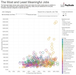
Click on picture to open interactive in a new tab.
At this point, PayScale offered to send me to the 2014 Tableau Conference. My knowledge and experience with Tableau was continuing to grow. I couldn’t believe that 6 months prior I had never heard of the software. In such a short period of time, Tableau had become one of my strongest technical skills. I used it for both data packages for the website as well as for my internal analysis projects.
Going to the conference was one of the highlights of my year. It gave me a new perspective on what we could achieve with Tableau.
Shortly after, I was assigned the analysis work for a new pilot project at PayScale. We were launching a new project where we would partner with universities to survey alumni about career outcomes post-graduation. Because we are the largest database of individual compensation profiles in the world, PayScale is in a unique position to give universities new insights on their alumni and programs.
The plan was to partner with 10 schools in order to understand what information they find valuable. The initial report for the first school was presented in an Excel workbook that contained the analysis of the survey responses. We quickly discovered that this format was overwhelming and difficult to digest for some of the audiences we were trying to cater to.
Being the Tableau enthusiast I had become, my ideal solution was to present the data to the schools in a visually stimulating format. I developed a PDF report with graphical representations of the same data that received positive feedback.
Most of my time shifted from my typical analysis work to developing our new alumni reports. The report format evolved with each school in the pilot. The 4th school in the pilot, Wittenberg University, made their report public and it can be seen here.
Our report methodology and presentation is still evolving and I am currently in the process of automating the report. Developing a new product that combines analysis with data visualization to provide data to new customers in a consumable format surpassed all expectations I had for my year.
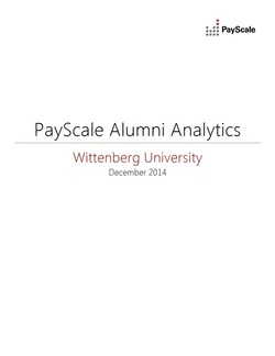
Click on the picture to open PDF in a new tab.
I continued to create the visualizations for our data packages. One of the more complicated visualizations was for our largest data package every year, The College Salary Report. It examines the maturity curves for degree\major combinations to find out how much graduates with different degree and major combinations earn with 0-5, 5-10, 10-20 and 20 years of experience.
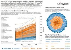
Click on the picture to open interactive in a new tab.
We recently examined income trends for restaurant workers for our Tipping Package. This visualization was embedded into an article on Eater.com here.
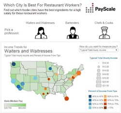
Click on picture to open interactive in a new tab.
When I hit my one year anniversary at PayScale, I couldn't believe one year had passed since the beginning of my Tableau journey. It was time to start revisiting visualizations for our annual packages. First, I revisited the Compensation Best Practices visualization. Instead of simply refreshing the visualization to include the 2015 data, I was now able to enhance the visualization to produce a new and improved final result.
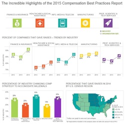
Click on picture to open interactive in a new tab.
Now here's the really good part. This next part felt like I was at the end of an awesome chick-flick where the girl gets the guy and everyone lives happily ever after. In January I received the combined job title of Data Analyst / Data Visualization Specialist.
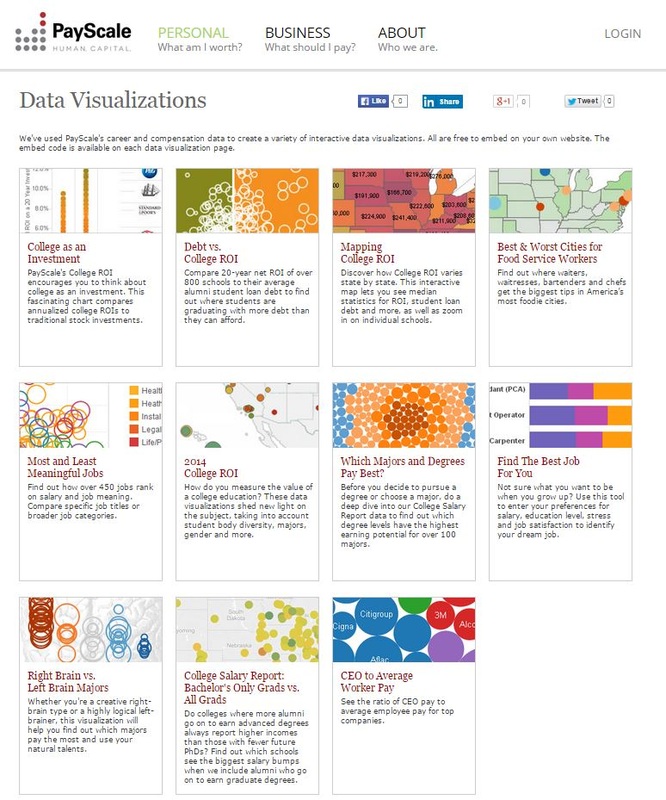
I was so happy that PayScale recognized my work with data visualizations and is in support of me taking my career in this direction. The design and content help throughout the year from the rest of the team has been invaluable to my viz skill development. In addition to the job title, they recently sent me to Georgia for the Tapestry Data Storytelling conference where I got to learn from some of the top celebrities in the data viz world. We also now have a "Data Visualizations" page on payscale.com that showcases these visualizations.
I was so happy that PayScale recognized my work with data visualizations and is in support of me taking my career in this direction. The design and content help throughout the year from the rest of the team has been invaluable to my viz skill development. In addition to the job title, they recently sent me to Georgia for the Tapestry Data Storytelling conference where I got to learn from some of the top celebrities in the data viz world. We also now have a "Data Visualizations" page on payscale.com that showcases these visualizations.
Click on the picture to open in a new tab.
Lucky for me, it doesn't end there. Shortly after, I won a second Tableau Viz of the Day for one of the three visualizations made for the 2015 College ROI package. The refresh and revamp of the Mapping College ROI was featured on the Tableau Public website as viz of the day on March 11, 2015.
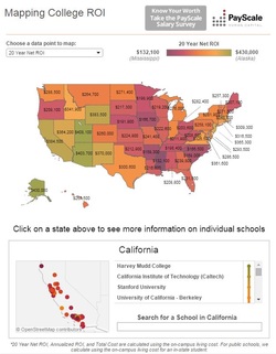
Click on picture to open interactive in a new tab.
Click on picture to open interactive in a new tab.
Click on picture to open interactive in a new tab.
Keep an eye out for what is coming next. I've got a good feeling this is really just the beginning...I can’t wait to see what my future in data visualization holds!
