
adding a colorblind eye to my dashboards
Let me start by saying that I am a fan of using red and green or "traffic light" colors in my data visualizations. Yes, I know this is not always a popular opinion.
In my experience, I have found this to be a highly debated topic and often said to be bad practice. I understand the reasoning behind the case for avoiding traffic light colors. For the percentage of the population with color vision deficiency, red and green can be indistinguishable and the visualization can become meaningless. I was recently at a workshop with Steve Wexler in Seattle on the Big Book of Dashboards co-authored by Steve, Jeffrey Shaffer, and Andy Cotgreave, and one of my greatest takeaways was a reminder that the objective of a dashboard is to facilitate the largest amount of understanding to the most people in the least amount of time possible. This is precisely why I often use red and green in my business dashboards when I am working with stakeholders who are accustomed to a red/green palette to indicate positive and negative results.
The majority of my stakeholders (most amount of people) are accustomed to a red/green palette to indicate positive and negative results (largest amount of understanding) and therefore there is no time required to decode the meaning of the color (least amount of time).
Of course, whenever I have had a stakeholder who was unable to distinguish between red and green, I would use a color palette that suited their needs. That being said, it has not been my standard practice to always design my dashboards to be colorblind friendly just in case. Now, I believe I have found a compromise.
To this day, I have not been convinced to stop using red and green. I have, however, been convinced that I need to come up with a solution to make a single dashboard effective for all potential stakeholders. Recently, I had a "light bulb" moment after discussing the issue with Steve and a few respected data visualizers in the community.
My solution is to add a 'Colorblind Eye' to my dashboard that can be selected to convert my dashboard into a colorblind friendly palette by leveraging the sheet swapping with action filters technique (there is a great blog post by Simon Runc on how to do this that can be found on the Tableau forum here: https://community.tableau.com/docs/DOC-8385)
Before I get into the example and how-to, please note that I am far from the first to have this light bulb and there are many great posts out there describing this idea using both action filters and parameters (including VizWiz and Tableau).
Example
I have updated a sample dashboard that I created on the publicly available City of Bellingham General Fund data to include a colorblind eye that will change the color palette from the default red + green to the colorblind friendly orange + blue on selection.
| Default Red + Green 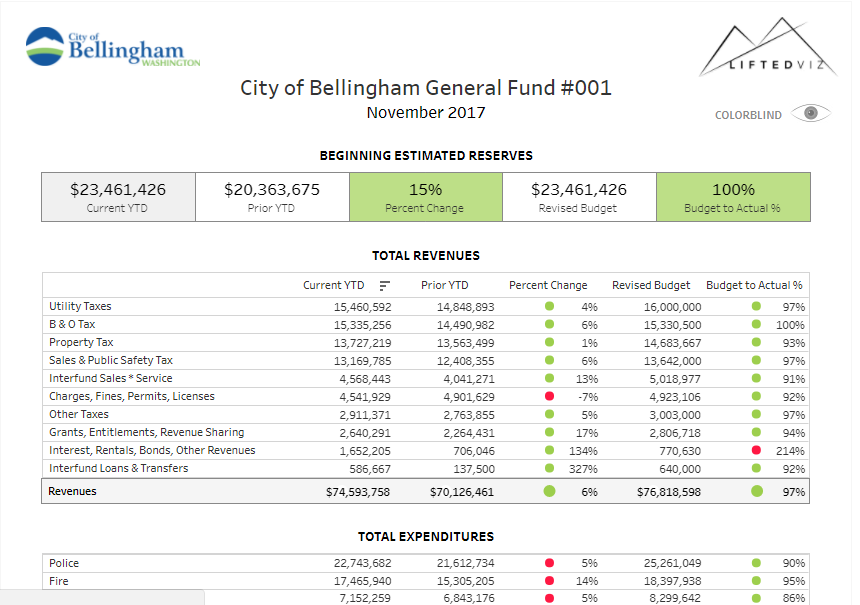 | Colorblind Eye Selected 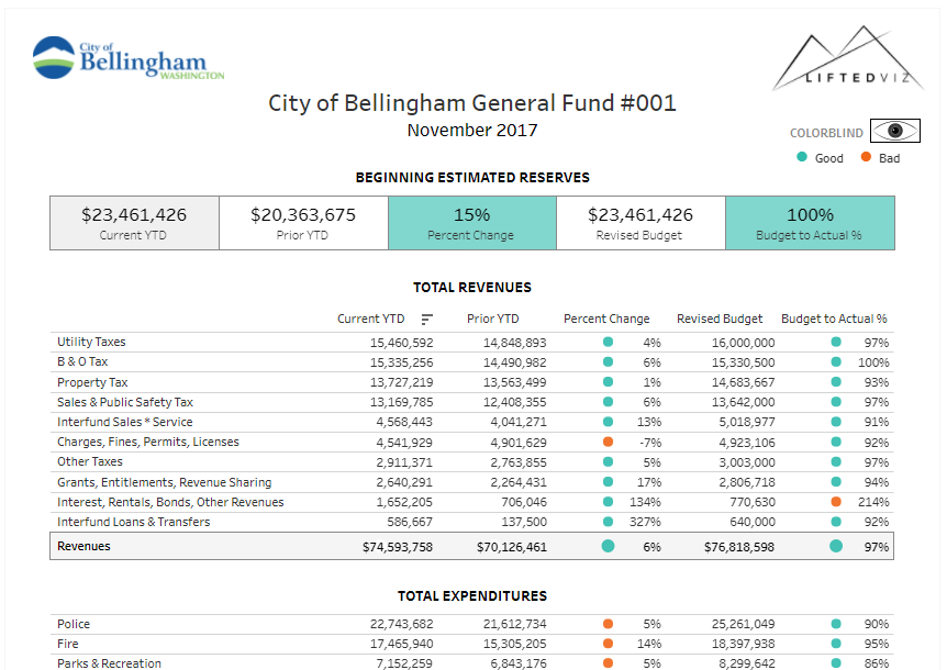 |
how-to
- I created a sheet that leverages a placeholder dimension called 'Eye' that is blank ("") on shape with a custom shape of a picture of an eye.
- I duplicated each sheet on my dashboard that uses red and green and updated to use a colorblind friendly palette.
- I used the sheet swapping method referenced above to swap the red and green sheets with the colorblind friendly sheets when the eye is selected on the dashboard:
- I create a calculated dimension "Swap0" that is just 0
- I create a calculated dimension "Swap1" that is just 1
- I added "Swap0" to the details shelf of the sheet with the eye image
- I added a layout container to the dashboard for each sheet that needed to be swapped
- I added the regular and colorblind version of each sheet to a layout container on the dashboard
- I added a dashboard action Regular Show on Deselect
- Source Sheet: Eye
- Target Sheet: Regular Sheet
- Run action on: Select
- Clearing the selection will: Show all values
- Target Filter --> Selected Fields
- Source Field: Swap0
- Target Field: Swap1
- I added a dashboard action Colorblind Show on Select and Exclude on Deselect
- Source Sheet: Eye
- Target Sheet: Colorblind Sheet
- Run action on: Select
- Clearing the selection will: Exclude all values
- Target Filter --> Selected Fields
- Source Field: Swap0
- Target Field: Swap0
- I added an extra sheet for a colorblind legend and included it in the target sheets for the dashboard action 'Colorblind Show on Select and Exclude on Deselect'
- I selected and deselected the eye to default the dashboard to the regular sheets
The Result
Interactive Viz on Tableau Public
Now I have a dashboard with clear red and green dots for the majority of end users and the option to switch to a colorblind friendly palette for those who can not distinguish between the red and green. This will not be a solution in every situation (performance may be a concern with large data sets) but I plan to use this method in the future when possible. I hope you find this idea useful!
Now I have a dashboard with clear red and green dots for the majority of end users and the option to switch to a colorblind friendly palette for those who can not distinguish between the red and green. This will not be a solution in every situation (performance may be a concern with large data sets) but I plan to use this method in the future when possible. I hope you find this idea useful!
